Everybody has heard the controversial stories of gurus creating successful enterprises based on a business model written on the back of napkin.
I always have been a believer in simplified visual models to explain complex things: “One picture says more than a thousand words” but Dan Roam has taken this idea a step further and created a complete theory and methodology around it.
I recently bumped into his book “The Back of the Napkin: Solving Problems and Selling Ideas with Pictures” but it has been around some time. The book was published in 2008.
A very nice introduction to his ideas, presented by him to the Commonwealth Club of California, you can find on http://fora.tv/2009/02/24/Dan_Roam_Back_of_the_Napkin. Another video is available on YouTube:
Below you?l find some of mine personal highlights.
Where is the picture?
One of the things Dan says, if you ask young children, in the first year of a primary school, if they can draw a picture they all will raise their hands. If you ask them who can read or write some might hesitatingly raise their hand.
Ask the same question to adults you?l get a reversed answer. Does it mean we all lost the capability of drawing when getting older? No, off course is doesn’t. It only stresses that a lot of people are reluctant to make visual representations of their ideas. However it shows that who’s capable of representing complex problems visually has an advantage because we all know that one picture says more a thousand words.
According to Dan whoever describes the problem the best is most likely to solve the problem. It boils down to: whoever is capable of making enough abstracting of a problem based on insight, so the core of the problem can be presented in a simple way, is more likely to find a solution to it. In business terms this might mean Who will get the contract. If you are expert drawings can help you to get your message across to a audience with lower expertise.
Dan takes this idea a step further. Based on visual modeling techniques you can become the expert because the drawings can help you create insight in a complex problem.
Dead by PowerPoint!
Presenting a very complex diagram, with all of its details, at once will result in a blockage in your audience. It is better to build up the diagram step by step and may-be leave some details out. Diagrams should be limited to boxes, triangles, circles, arrows and stick figures. Using these should be sufficient to get any message across. Making it more detailed than this, you?l risk losing your audience.
The more human the picture the more human the response!
If you want any interaction and feedback don’t present results that look too finished. Smooth and clean slides do not look like a work in progress so the involved parties might think that already everything has been decided and the presentation is just a formal requirement to convince them. If you present something coarser material your audience will be much happier to jump in and reason with you in order to help you to create a finished result.
Who owns the whiteboard?
“You’ll have black-pen people, yellow-pen people and red-pen people when you’ve meeting in front of a whiteboard” explains Dan.
The black-pen people are the ones that think visually and what to start drawing to understand the problem. They are very eager to run to the whiteboard but do not necessary understand the problem.
The yellow-pen people have some understanding of the problem but are not that visually oriented. So the like to highlight, hence yellow-pen, some parts where they can add their input.
The red-pen people are the experts. They find that the problem is drawn over-simplified and under these conditions they don’t want to give their input. These are the one that get fed up in the middle of the meeting and start correcting, hence red-pen, the diagram. The idea is to get them fed up so they start giving their input.
Why some like words instead of drawings?
The idea of diagrams is that get the message across in an unambiguous way. So drawings are very useful if you want to be sure that everybody got the idea even across cultural and language boundaries.
If the goal is not to clear up the confusion but to put across a more political message you can understand why some people would like to avoid creating crisp and clear diagrams about what they are saying.
What is Visual Processing?
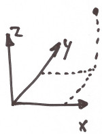
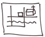
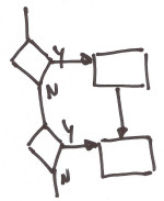
This is the cognitive process behind visual thinking. According to Dan our visual thinking has six core activities or parts:
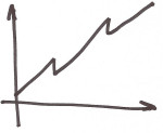
When: physical change in the where of the what, the passage of time.

Why: deducing how the world works, relationships between how, what, where and when.

Conclusion
I still need to read the book. But I think the ideas behind it are quiet solid. They at least feel natural to me. I have had in my professional life the same kind of experiences. Falling back on a whiteboard because the slick presentation, with overly complex diagrams, wasn’t getting any attention.


